
The Importance of Color

Often when an organization begins the process of expanding their presence on the Internet, they put the majority of their thought into how they would like the site to function, what they would like it to say, and how it will facilitate their current business. While all of these are very important functions for your website, the fashion in which your product is presented does much to affect your customers overall impression. And a good impression sells…
Starting With the Basics
The Composition of Color
Before we launch into improving your web site’s effectiveness through color, it’s important to get a basic understanding of how color is constructed. There are two basic ways of creating color as seen by the human eye: subtractive and additive. Using the subtractive method, the entire wavelenth of light is absorbed by a given object and only selective colors or hues are reflected. Thus, when you look at an orange, the reason you see that color is because the skin of the orange has absorbed every other color in the wavelength. In the additive method, selected wavelengths of the light spectrum are combined to form the color desired. This method is most often used by televsions, computer monitors, or any other device which emits light into recognizable patterns.
What Color is That?
Determing how to describe color has often been a challenge for web designers and their clients. After all, considering that most experts agree that the human eye can perceive somewhere around 6 million different colors, it can be quite difficult to explain what color burnt orange is to anyone outside the country. Thus, many different methods for describing color have been developed, the most basic being hue, saturation, and value or HSV.
- Hue – describes the color type (red, yellow, blue) used in the desired color
- Saturation – determines the strength of the color, the higher end resulting in more pure color and the lower end in grayish tones
- Value – describes the brightness of the color, or how much white or black is applied to the color
There have been many other methods developed to determine color space, however this has been time tested as the most effective in regards to the layperson’s need to describe color. However, other color models may better fit your needs and thus it may be to your advantage to further research your options.
How Does One Make An Impression?
I’m glad you asked. Color is a principle factor in developing a lasting impression of your audience. I’m sure many of you reading this believe that choosing a good color to represent your product is determined purely by personal preference; however, if I can get just one idea to stick in your head it is this: color impacts your customer on many levels other than personal preference, most notably on a psychological and physiological level. Thus, the decision you make in regards to your site’s color scheme can have a dramatic impression, either for better or worse on your potential success.
Color, Psychology, and Sales
How does color have a psychological affect on your customer and your product? Let’s use a simple example to further  examine this factor. Let’s say your customer, Bob, is your average 30-something American male and as such, enjoyed playing baseball in his youth. In fact, some of the best times in his life are related to his participation in his high school’s varsity team. If that team was the “Cardinals”, chances are above normal that he has a high disposition for being partial to the color red. Thus, anything that is red has a sub-conscious connection to his past happiness. Alternatively, Susan may have been the unfortunate victim of a severe collision in her childhood. She has done well in her recovery, in fact she bears no noticeable scars from the incident. She has even done well to forget the incident, except for the lasting image of a large red truck just about to plow into her vehicle. Because of this, and possibly without her conscious knowledge, the color red still instills an unnerving anxiety in her daily life. Similarly, many colors that we either love or hate can be attributed to some psychological stimulus that may have affected our everyday thinking years or even decades ago.
It is important to note that many colors have a subconscious reference in our collective psyche and thus can be used to effectively communicate aspects of your product. One example of this is the use of colors of red and blue to describe hot and cold on a large variety of products. And before you think, “Well of course, that’s just common sense,” it’s important to remember that the hottest fire most often glows blue and that it is quite possible to receive “burns” due to severe cold. However, so many of us have grown up with this color association imprinted in our memory, that these associations are often used on many products and to great effect. Communicating certain aspects of your product through the use of color association is a highly effective way to positively influence your potential customer.
Physiology and Color
Another manner in which your products color scheme can have a tremendous impact on you site’s overall success is through your body’s perception of color. This is different from psychological factors in that it is determined by specific physiological reactions to color as opposed to past experience or any subconscious factors. The premiere example of 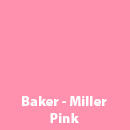 this kind of reaction is witnessed in the human reaction to the color Baker-Miller Pink. The effectiveness of this color in reducing stress, aggression, and hunger levels was first observed on the U.S. Naval Correctional Center in Seattle, Washington. Naval Corrections Officers Baker and Miller, on advice from a local psychologist, painted the interior of the center’s admissions cell this particular hue in an attempt to relieve the aggression that individuals exhibited when imprisoned. To their amazement, the prisoners of the cell showed a marked decrease in aggressive behavior and increased willingness to comply with the instructions of an authority figure. In another instance, George Lumkin, an associate coach for the University of Hawaii’s football program was witness to locker rooms painted in Baker-Miller Pink with the hopes of calming the aggressiveness needed at the collegiate football level. His complaints, led to a new rule instituted in the WAC conference stating that the visiting locker rooms color must be the same as the home teams. Thus negating the use of this color, unless of course they home coaches wanted to expose their own team to it’s affects as well. These are just two examples of colors which have a physiological impact on the viewer, many more exist and can be used to your advantage.
Color and Profitability

Some may be surprised to learn that many huge corporations with household recognition have spent millions of dollars to determine the color for their branding and packaging. They do so in order to find the perfect color that would best increase the profitability of their product. One of the most recent success stories involving this form of market research is the New Orleans Hornets of the National Basketball Association. In 1986, the city of Charlotte, North Carolina was granted one of three expansions teams made available by the NBA in that year. As is the case with most expansion teams in any sport, the team management knew it could be many years before the team itself was successful enough to bring profitable attendance numbers to the organization, however they believed they could capitalize off of the high profit potential of the NBA’s market base. Thus, they went to work designing and determining the Hornets optimal branding and identity. After months of market research, they unveiled their new logo consisting of a cartoon-style hornet and a teal, gold, and purple color scheme. Almost immediately, the design was determined to be a huge success and the Hornets led the league in jersey and accessory sales despite not competing for a playoff spot for many seasons to come. The New Orleans Hornets proved that the decision of color and branding can be a profound driver of your product in the marketplace.
The New Black
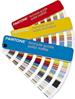
For decades there had still been one major problem that plagued designers, manufacturer, and clients. How does one ensure that the desired color has the same “look” from the designer’s screen, to the manufacturer’s printer, and finally to the client’s product. After all, in this process we’re dealing with a variety of monitors, printers, color models, and processes. In 1963 Lawrence Herbert created the company, Pantone Inc., which would provide the solution. His unique and ground-breaking method, the Pantone Color Matching System provided the industry a way to identify, match and communicate color with a minimum of guesswork. To this day, Pantone remains the world’s authority on color and it’s implementation in design, production, and marketing.
Additionally, Pantone is one of few companies involved in developing the color forecast in many of the major commercial markets including the automotive industry, design and architecture, and fashion. Their experts used industry data, market research, and years of experience to determine which colors will be desired for the coming season. So the next time you hear “color X is the new black,” be aware that this may not be just a quick judgement or whim based on intuition, but a carefully determined prediction of the upcoming marketplace by the experts at Pantone.
It is clear that color can play a very large part of your organization’s success. This does not mean that every company needs to pour millions of dollars into the decision, only that it is a decision which should be made using every resource at your disposal. If you would like to find out more about what we can do for you on this or any other matter, please feel free to send me an email using the link below. I’m always happy to share my knowledge to those who will listen.