
Website Design Process – Creating Your Website
There are a number of factors in website design that affect the style, process, and price of your website. This tutorial will guide you in understanding the primary components of a standard web design.
Style – Geometric of Organic
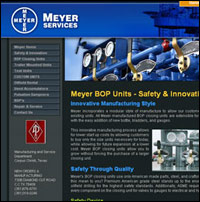
Example Geometric Layout |
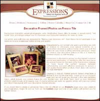
Example Organic Layout |
Most website designs can be divided into two style categories–geometric or organic. The first design pictured above incorporates a geometric, straight-lined approach to the layout. The design to the right has a more organic, soft-edged look and feel. Each has its own strengths and can help convey a different message or idea around the content of the site or the type of business for which it was created.
Typically, geometric layouts convey a clean, professional, and straightforward image. This style is often used for businesses related to the industrial, technological, or financial sectors, or any business requiring a conservative, professional design. Geometric layouts usually employ straight lines, rectangles, and stock photography.
Websites with a more organic style are great for businesses which want to project a lively, colorful, and interactive feel to the site. Educational websites, business catering to children or family fun, or artistic websites typically follow an organic design. Organic sites often have curves and vibrant color, or they may incorporate hand-drawn illustrations and other eye-activating aspects such as Flash animation that generally give the site more of a dynamic feel over their geometric counterparts.
So which of these sounds more like the design you’re looking for? Do you want a strictly professional feel or do you lean towards a more fun or artistic design? Don’t think that it can only be one or the other, and many of our clients balance the two layouts.
Color
Color is an equally important factor in your design considerations, and often, color choices will center on logos already in use by our clients. Again, we want you to consider the image you wish to project, so we can determine whether a warm or cool color scheme is appropriate.
Cool Color Scheme |
Warm Color Scheme |
Cool colors tend to have a calm, soothing effect on the viewer and are often used in industrial, financial or technological sites, though it’s a popular color in general across the web.
Warm colors typically convey a sense of energy, evoke a response, and may be considered more inviting. They’re great for sites relating to restaurants or any business projecting a cozy or high energy feel.
Alignment and Sizing
Most of the sites we create are “centered” layouts. In a centered layout, the website is positioned within the middle of the browser window even when the browser is resized.
For all websites we design, we test the site’s appearance on different operating systems (Mac or a PC) and different browsers (Internet Explorer, Firefox, or Safari)–often referred to as “cross-compatibility testing.” Since different computers may potentially display your site in an unintended way, this testing ensures that each visitor sees the site as you designed it. Additionally, we’ll confirm that all of our websites are appropriately sized for different monitors of varying sizes and screen resolutions. A website may look tiny on a large monitor, but the same website may take up the entire screen on a smaller monitor.
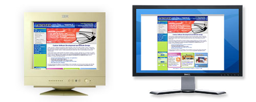
Example of how our site could take up the entire screen on a smaller monitor and only take up a portion of the screen on a larger monitor
Frequently, we receive requests for website designs that stretch the full width of the screen regardless of the browser’s width or the monitor’s screen size. While we are happy to offer these “100% width” designs, we do like to caution our clients about the additional costs for this design style due to the visual challenges for which adjustments must be made.
For “fixed-width designs” or websites that adhere to a prespecified width, we have complete control over how the visual elements of your site are aligned. For 100% width designs viewed on a large monitor stretched across a full browser’s width, spacing issues may affect the layout of the design or content requiring multiple tests and subsequent adjustments.
Similar to the challenges posed with 100% width designs are fixed-width designs that aimed at users of today’s wider screens especially prevalent in laptops. If the design template is too big, then certain parts of the site may get cut off for users on older CRT monitors. For all designs, our design process focuses on making the site viewable on as many monitor configurations as possible.
Content Management
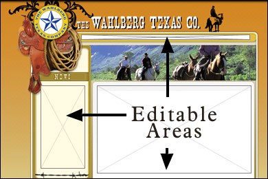
Our sites generally include what’s called a content management software which allows you to easily edit your website’s contents. Each site has its own edit links with which you can login with a secure username and password and have the ability to change text, add pictures, new links, or even new pages.
The general content area in the middle (where all of your main text will go) is always created in an editable format, and we have the capability to make menu and footer text editable as well.
Your navigation menus will include links like “Home”, “About Us”, “Contact”, and any other pages you would like your site to include. If having your navigation links be editable is a high priority to your business, then we can certainly make it easy to modify link names or add new links as you please. However, you should be aware that editable links will typically follow standard fonts versus stylized, non-standard fonts.

Example of editable navigation |

Example of uneditable navigation |
Above are examples of both editable and uneditable navigation or menu links. You will notice that the links on the right have more of a smooth, lively appearance and even a slight dropshadow beneath. We can typically make uneditable links more unique in appearance as we have many more fonts and visual effects at our disposal. The links will be rendered essentially as a flat, photographic image which requires our assistance to modify. These uneditable fonts work beautifully if you don’t envision frequent link changes.
For those clients who may need frequent changes to menu navigation, editable links offer an excellent alternative. Because there are only a few fonts that come standard with most computers, we are more limited in what fonts we can use for editable navigation links, and artistic elements such as drop shadows or glows are not available. However, the option to create an easily edited link for which you need not hire us for assistance may be worth the stylistic tradeoff.
Completion
All of these considerations serve simply to guide you on achieving the design that’s right for you. Once we understand your goals, we will create a mockup design to serve as a springboard for the finished look and feel. Sometimes our discussions yield a mockup ready for immediate finalization. Sometimes, our designs need a bit more modification or shift in direction.
Our standard web design includes up to three revisions before the design is finalized. We certainly allow as many revisions as necessary, however additional charges will apply.
Once we have completed the design process and you approve the layout, we will build the actual site out and allow you to edit these areas.